Thursday, April 30, 2009
Thursday, April 23, 2009
Thoughts about the logo that I needed to learn to recreate

I had to learn how to remake the Texaco logo. This above is the contemporary Texaco logo of today. The new logo doesn't have Texaco text below it because people believed that it didn't need it anymore since it is a well known logo by now.

My process was quite easy. I made a red circle the same size as the original, then I eye dropped the color from the original logo to fill in the circle. Then I used the illustrator star tool to create a star. Although I couldn't figure out how to make it more like the Texaco star; so I pen tooled the star above the original logo.
After deleting the illustrator star, I moved the penned star over to my own red circle. Now the only thing left was the letter T for the finishing touch. I used a different color to show the difference between the two. I tried many different styles of text before I found the right one. It was size 138 Franklin Gothic Demi Cond. Once I got that over to the other star, I changed the color of the text to the same color of the circle.
Finished product.
Shapes: Tutorial


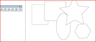
For this I tried to figure out how to do the shape tools. It was helpful to learn little tips to help me how to produce them faster and more efficient. I knew what to do basically (shift = even proportions) but some things I learned were that if you held down the shift+alt keys together, the shape will expand from the inside rather than the corner. The alt key will expand the shape from the inside. Also, if you press the space key you could move the shape without deselecting the shape. Also with the polygon and star tool, before you deselect the shape, you could hit the arrow keys up or down to add or subtract sides to the shape. That was very important to know, because in CS2, I learned that there was a menu that I could use to help me and in CS3 it is completely different.
This tutorial was great. I love learning new quick keys that will help me with illustrator. Some things I already knew, but the space key, alt key and arrow keys were new. That is great to know.
Wednesday, April 15, 2009
Postcard Crits.
Cherrie!!! This is for you!
I drew my hand in like 15 minutes.
So this was the one that I wanted to frame. Our professor made us look at a fuzzy picture then slowly made the picture clearer as time went on.
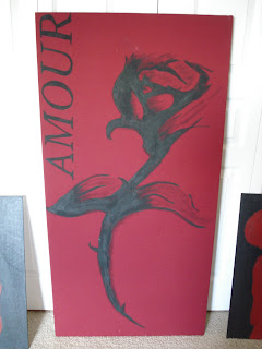
The next three pictures are a series. This was the first painting that I did. This was the picture that I sold before.
Tuesday, April 14, 2009
Process Notecards

So I saw Frank's work and I saw his animation Jail Bird that he did. I decided to bring a character that I created called Charles the Caterpillar. I started by creating Charles first. I though of different ways that he could become a part of "society".

I thought that Charles could be coming out of an apple.

I put then the two of them together. I had Charles on one layer and the background apple on another level.
Thursday, April 9, 2009
Frank Chimero-What Makes Him TIck....J.K. Just Some Info
Frank Chimero was born in Long Island, New York. His family moved to Springfield, Missouri when he was 8 years old.
Chimero states that he never really "dreamed" about being a graphic designer. His graphic career started to bud when he was in high school because his friends needed some advertisment for their band (t-shirts, posters, etc.). He then went to study at Missouri State to advance his design and illustrating techniques.
After college, he really was nervious on what his next step should be. He set up base in his hometown and become a freelancer for the summer. Afterwards though, he had enough clients that paid his bills so he decided to keep with being a freelancer. Although he is a freelancer, he is not really big on being alone. He moved his work into an office with a few friends that way he gets some interaction with people. He also teaches design at the university.
Interesting fact: Alan Fletcher was a big insperation for Chimero. To him, that was the only person out there that wasn't so "serious" about design, but designed in a way that was happy and innocent.
His clients include: The New York Times, Business Week, Starbucks, Fast Company, American Airlines, Edizioni Corraini Press, and Good Magazine.
Reflection on Patterns
Making patterns with different fonts was an interesting art form. I had never done anything like that before and I really enjoyed my first pattern for it's delicate looks (that was my edwardian font J). I really enjoyed seeing other peoples works but I don't think that I will continue doing this sort of designing. It's just not my style, but a person always has to try things once in life. Or in this case 4 times.
Adobe Live Docs


Live Docs was really helpful for the little details of Illustrator. I have had CS3 for about a year so I've been fiddling around a bit with it. So I figured out how to do those sorts of things, just maybe not as efficiant as these people did. I really learned about the masks and how to use them now. That was the one thing I wasn't sure about so I was really happy to learn about that. I want to probably do that one for my weekly tutorial.
Tuesday, April 7, 2009
Inspiration Pieces

This is a book called Working the Plate: The art of food presentation. I believe that with anything you could make a beautiful art piece. I love watching cooking shows that present their food in a classic and beautiful way.

This is a website for a magazine. The magazine is called Wedding Style and is a couture magazine. I'm not sure who made the website but I thought that it was absolutly beautiful.

This piece was posted on deviantart by a blogger named Rozefire. It was a vector piece but it was very good.

This was made by a friend of mine in high school. His name was Ian Anaya, and he was the best at what he did. He was learning on CS2 when nobody in our school could even afford that program.
Friday, April 3, 2009

Final product of the typography. I took away the background photo and let the letters stand out for themselves. First time ever using type to show a picture. I liked the experience of it. It was quite difficult for me but for a first time, I thought it was successful

For her arms I wanted there to be some defined color so that it didn't just blend in with the background or look out of place.

First picture I found then I started adding some typography to her.
Final 4 Patterns

This one was my fourth with Stencil Std Bold print. I thought the simplicity would be a refreshing change from my other patterns that I had done

This was my 3rd pattern. This was done with capital A's with Stencil Std Bold print. What I did first was to make a star out of 4 A's. This made a neat little design so I put 4 of the next to each other this started the base of the pattern. Then though it seemed to simple so I reversed the A's so the top of the A's were touching (not the bottom like before). Then I put the reverse into the blank spots left by the base pattern.

This was my second attempt at a typographic pattern. This time I used the letter Z with the font Juice ITC. As you can see this is a very busy pattern. The Z's overlap each other on the upper right corner of each Z. It was my least favorite one because of the size of the font. If someone looked at it far away, it wouldn't show very well. A bigger font with more spacing I believe would have done better.

This is my first pattern I created. I picked the letter J and decided to use Vivaldi Italic print. The lettering reminded me of a stuck up french bistro looking thing. Tons of loops yet fashionable in it's own sense.
Wednesday, April 1, 2009
Add on to the tutorial section...
So didn't realize that I needed to put commentary for the section I read over. Anyways, I thought the pen tool was helpful. I thought I knew most of the capabilities of the pen tool, but there were some helpful tips that could help me in the future.
Wedding Typography
 so, this is the starting point of my first work. I decided to work on an elegant woman in a lace wedding dress. Using letters found in 'wedding', I started using them to create a layer over top of the picture. This is the first time I have ever done typography so...I'm going to see where this ends up. I want to be able to take away the bottom layer (starting photo) and just use the type used.
Subscribe to:
Comments (Atom)


