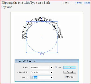
This tutorial was very interesting and helpful because I needed to put text in a circle. Starting out with a circle, you would then add text to the circle. Then you would copy and then paste it right on top of the original text. That makes it so the text is bolder. From there you would go to the type on a path option. You would select the accender and flip options. You can also preview it if needed. From there you can select your flipped image and then all you have to do is rotate it.
This was interesting tutorial because it taught me how to create my own spirals. I was wondering how to do that because the spirals for illustrator are quite recognizable. So this was a good thing to know. The person started out with an elepse and then used a direct select tool to pull out one side to create a brush like stroke. Take the convert anchor tool and make the tip more at a point. From there you can go to the brushes section and create a new brush. From there you select the spiral tool and create a spiral. Then you select it and then apply the brush you just made. Then from there you can change the point size of it so that way you can thicken or shrink your spiral.
This tutorial was how to use the illustrator tutorial without really making to much change. To make a spiral then use the direct arrow to change where the edge of the spiral to match with other spirals you may have. From there you can change the thickness of the point level.
For the Andy Worhol look I looked up
http://www.melissaclifton.com/tutorial-warholphoto.html. From there I learned a way on how to make my own pop art with my own pictures. First you want to create this main picture in another layer so that way you will still have the background to work on. From there you could pen tool the outline of the objects you want to see. Then you would use the desaturate and change the brightness. From there you would use the cutout filters to make the levels change to the picture up above. To get the colors that you want, you could fill in color to the background layer the color you want. For the people colors you could it this way.
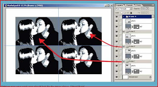
Create a new layer in the "frame 1" set and rename it "pc". (That stands for people color, not very imaginative). Place this layer between the two existing layers. See below picture. Now holding down Ctrl click on the layer "photo" in the Layers Window. You will see a little dashed-line square appear on the cursor hand. See image below.
Note if you are HAVING PROBLEMS WITH THE ABOVE, instead click on your "photo" layer in your layer palette thenSelect >> Load Selection
Look at the canvas and you will find the "photo" subject/s perfectly selected. Now still working on the "pc" layer, grab the paint bucket tool and fill the selection with you a vibrant color.
Now click on the "photo" layer and change the mode to Screen. See images below. That's method 1 done
Create a new layer in the "frame 1" set and rename it "pc". (That stands for people color, not very imaginative). Place this layer between the two existing layers. See below picture.
Now holding down Ctrl click on the layer "photo" in the Layers Window. You will see a little dashed-line square appear on the cursor hand. See image below.
Note if you are HAVING PROBLEMS WITH THE ABOVE, instead click on your "photo" layer in your layer palette thenSelect >> Load Selection
Look at the canvas and you will find the "photo" subject/s perfectly selected. Now still working on the "pc" layer, grab the paint bucket tool and fill the selection with you a vibrant color.
Now click on the "photo" layer and change the mode to Screen. See images below. That's method 1 done. (Taken from the website)


