Sunday, June 7, 2009

Cartoon Bubble Tutorial

Again this was a test before I would do my Hoots book. Found this way from a guy on youtube. Was interesting on how he did his, and a little bit obsessed, but oh well, to each his own.


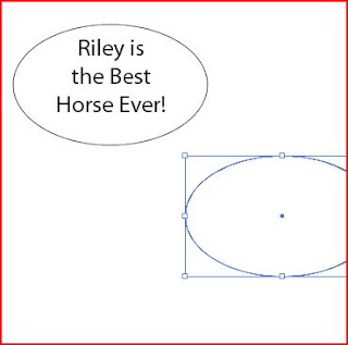
So this is how this guy started out: First draw a circle around the text and then make a copy of the circle. Send the copy circle to the very back layer and put it flush against the top circle. From there you will make the bottom circle slightly bigger to make a more "realistic" or handdrawn effect. *Note: you will also want to put the top circle in a white middle and no boarders that way you will have no interferance when attatching the arrow.
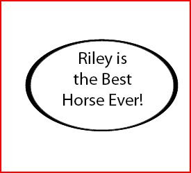

So here you have this starting, now all you would have to do is add the arrow pointing to someone. He suggested to use the pen tool which is very handy. From there, you would have your own arrow that would be apart of the bubble except for one thing: the arrow is on the very top. That is easily remedied.
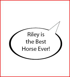

As you can see I fixed the arrow by sending it backwards one layer. I found this excercise good to know, but I found another way to do this sort of thing. If you wouldn't want the whole thick circle around the bubble, then you could just take your pentooled triangle, and circle, overlap them the way you want them too and then use your pathfindertools and combined.
Saturday, June 6, 2009

Mesh Tool Tutorial

So this little tutorial I found on youtube. I wanted to do a gradient mesh for one of my Hoots Owls so I looked this up to figure out how to use it. It almost works like a gradient, but it gives objects more shading properties like you will see in this demonstration.


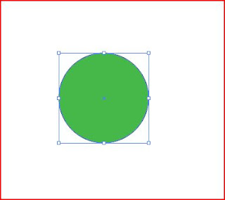
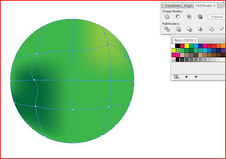
This is my first object. I drew a circle and I made the insides green so that way I could make a green ball. I then selected my circle and went to the mesh tool on the tool bar. From there, the only thing you must do is point to a spot you wanted there to be part of a graph and click. Once you make your desired graph, you can use the direct select arrow to reposition, or change the curves to the graph all within this one little object.


So here in this picture you can see my little graph within my circle and what I am trying to do is eminate a ball. The gradient starts from one of the dots and then gradually decreases as it goes out from there. As you can see I'm using my color swatches to change the colors among the circle. *note: in order to change the color, you must first select the point in which you want the color to go.


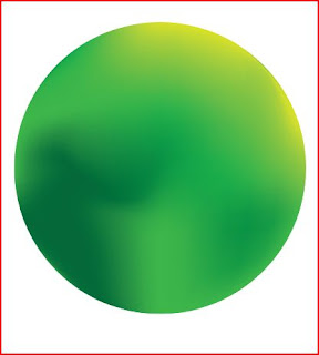
This is my final rendition of my ball. I just made a quick sample of a ball using different shades of green/yellow to create that sort of effect. You just have to tweak it around and play a bit to get it right, but overall, it is a great skill to have when you are making 3 dimentional objects.

Brightening up a dull photograph Tutorial

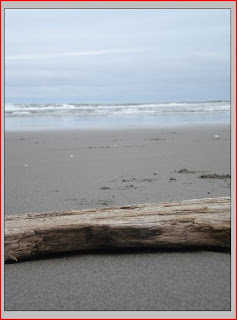
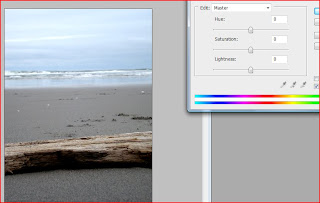
So this tutorial I watched before and I have many "dull" photos since I live in a grey state. Beautiful but still grey most of the times. Anyways I decided to use one of my pieces when I went to the beach.


As you can see, the picture has a lot of combining tones and is just dull beyond belief. That day it was windy like none other. It was kinda cold too; a hoodie and some jeans were required. But this picture I loved.


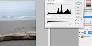
So what I did next was I went to my levels to change them. As you can see on the right hand side of the page, when you change the levels, it creates a new layer.


From there I just fiddled around with the levels. I brought in the darks so its a little clearer, mess only a little with the medium tones and then just a little from the lights. That way more detail would be seen thoughout the entire piece.


Now I wanted to make some things just a little more brighter of a color. Going in to Hues/saturation is the key for this. I used the Edit: Master to make the entire photo a different saturation. If someone wants to just adjust a certian color like blue, you would have to go up to Edit:Master and there is a selection for blue (or various other colors). If you don't know what classification a certian shade is, you can use the eyedroplets that are there above the 2 color lines. This will help you select a certian area in which you would want to change.


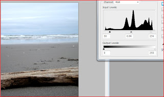
So here you can see I have 3 layers. The original picture, the changed levels I customized, and finally the hue/saturation level in which I explained on how I did that.


This is the final piece. As you can see, the wood is a different shade of brown and the sky and water are bluer than they use to be. This tutorial was very helpful and I hope it helps anyone else who is wondering about the same thing.

Week 5: Tutorials

So my week 5 tutorials. I found this website called photoshopsupport.com. And there are some interesting things in there that I didn't know about. Although, these tutorials are samples from their larger CD; so some of the tutorials start off in the middle of a big tutorial.


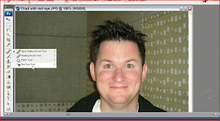
So this is the guy that talks during the tutorials and his name is Chad I found out. In this tutorial he demonstrated how to get rid of red eyes easily. I thought just taking a black brush would do the trick, but he actually used the red eye tool which is under the spot healing tool. From there all someone would have to do is to point and click. Simple yet effective.


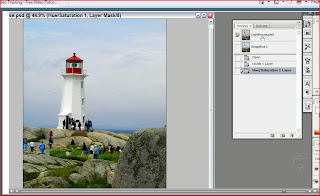
This one was actually really interesting and I learned a lot from this little exercise and I want to do it with one of my dull photos. So that will be a later addition to my weekly tutorials that I must do. He started out with a dull grey picture and what he did was went into the levels selection to brighten up the image a bit. Next he wanted to brighten it up a little bit more. He went to the hue/saturation and started changing the whole thing to be a little brighter. What he did next was very interesting and I had no idea that this was an option. There is a way to edit just one shade of color. So for example, he selected the sky which is blue, and selected it to change just the blue. Then he did it for the grass as well to make it more green. Wonderful tutorial and very helpful since living in Oregon a person doesn't get the best of weather to shoot in.


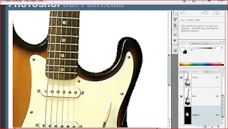
I have had hard times with some of the select tools so I found this one about the direct selection tool. One of the helpful ones that I liked. He gives little tricks along the way on how to make the "brush" larger or smaller at the hitting of one button, and he explains how to make sure you get most, if not all of the item that you want to select. He also shows that if someone doesn't want to have an area selected you hit shift I believe and it makes the direct select tool opposite to what it is suppose to do. Quite helpful if I have to do that sort of thing.


This tutorial was quick and somewhat helpful. This is the one where there was a bigger tutorial happening, but they only showed one step in the process. I think it would be fun to do it, but overall, it wasn't the most helpful.


Week 4 tutorials


This tutorial was about how to rightfully change things without damaging the original image. What i learned was to make a copy of the background, but what this tutorial was saying is that you could use the button next to the add new layer. That will add an additional layer, but it will help from changing the image and possibly damaging it to where you cannot do anything to it.


This was a really neat little thing I never knew about. There is a vanishing point option within this program and the person talking in this tutorial was talking about how the grids are color coded to help understand what will work and what would not. I thought this was great because I learned from Art 119, that in order to do that sort of thing you would have to make your own lines and what not. That was horrible and I am so glad that I know that there is justice for us.

This was interesting to learn. This guy was walking through about turning colored images into black and white photos and I thought neat...lets see what this is about. Well this guy pulled up the screen showing the individual slides of colors and then what he did was proceed to talk about how you can change the shades of things depeending on what color they were before. So for example, he wanted to brighten the trees and grass so he went to the color green slide and moved that up towards the white. That brightened up only the parts that used to be green. That was fantastic to learn so that way I can still dr. my images up even if I want them black and white.

Pathfinder Tutorial: BittBox

I wanted to explore pathfinder a little bit more since it is such a useful object in illustrator. I was sent this little tutorial, thanks to Kate, and it help me keep things straight and I learned about the expand button which was very helpful. Thought it could have been one of those buttons that would start the self destruct mechanisim knowing my luck haha.


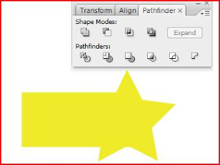
Anyways, all fakeness aside, I make a quick couple of items; A black rectangle and a yellow star. I placed them on top of each other and then selected them both. This little demonstration you see above is the result of me clicking the upper left corner "button" right below the words "Shape Modes". It is the Add to Shapes area. This combineds the two shapes together into just one. The color takes form from the top shape hence why you see yellow. If a person wants to make this just one object, the person must immediatly click on the "expand" button on the far right of the menu.


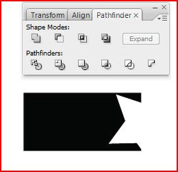
This is the second in on the left hand side of the top row. This is called the subtract from shape area. This minuses out the top layer and leaves only the remains of the top layer and the bottom layer. Again, right after clicking the button, a person can click on the expand button and make a single shape out of it.


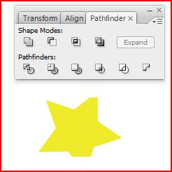
Third in from the left. Intersecting Shape Areas. This little button will take the overlapping parts of the objects you have selected and then making those overlapping parts the only parts you see. As you can see, two parts of the star are gone, you will see where they went in the next capture.


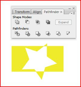
Last but not least, the Excluding Shape Areas. This creates the opposite effect of the above capture. It is taking the outside of the top shape and making it into an cutout.
Overall, in each of these pathfinders, a person can click on whatever shape area they want and then make it into its own shape by itself by just clicking the "expand" button. Love this little tool and will most likely use it a lot in the future.

Photoshop Tutorial: Photoshop Text

This was a photoshop tutorial that I needed to do for my book. This was a test trial one that I did before I went on to do my final Hoots piece. So you can start off with any photography that you want within the words. I picked a photography I had used previously for my tutorials.


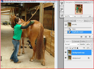
So the first step is to load up your image and then drag the "background" layer down to the bottom of the layer page and make a copy of it. Simple so far.


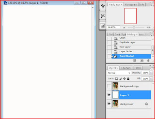
Now what you want to do is to create a new layer and put it between the two pictures (background and the copy) like what you see above. Now fill the whole first layer with white; you can use the paint bucket from your tools to get that.


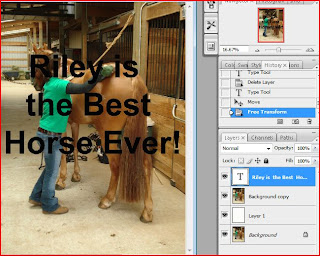
Now clicking back on the background layer, you click on the "T" tool (text tool). Now you write whatever you want. I choose to say that Riley is the best horse ever! (true fact actually; very sweet horse) You can do a free transform of it so that way it will fit how you want to ctrl+t (PC) or apple+t (Mac) *Note: make sure your text is bold enough so you will be able to see the background image. Cursive is not recommended


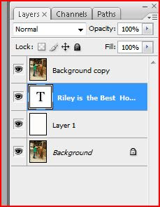
Now you must put that text layer below the background copy. It was above, now it must be below. This step insures that you will still be able to see the text when you move on to the next step. Now what you must do next, once you have that set up is to go to your layers bar up near the top of the screen and drag down and select the "create clipping mask" or you can hit alt+ctrl+g (PC) or symbol (don't have an equivilant on the PC)+apple+g (Mac). *Note: will be under the exact same layer selections so don't worry. It actually is sometimes difficult to find the right symbols to tell people for macs. O well, grew up on PC's and it seems to run these programs fine at this moment. Anyways, once you create that mask you will be in business.


So this was my final image. I think I could have gotten the text larger if I used less words, but its a text trial and it worked so what the hey. Hope this is helpful to anyone.

Friday, June 5, 2009

Final Book Project and Final Thoughts

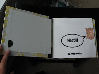
So this was the final project in Art 120. This book was a fun one to make; Luckly I ended up with no pix. or anything really going wrong with my prints. Overall, the creating was the easiest yet the production of the book was a bitch. I never sweated over making something this much, but for all that sweat and panic at times, I am very happy with my first book. I loved the paper I used (and thanks to the wonderful staff at Paper Source for helping me) and the whole thing was just fun. No real regrets that I can really complain about.


This right above is the inside cover of my book. The book is titled "Hoots!!!" and it is a short narrative about a little carved owl he got in India. The page opposite to the title page actually has my wax seal on it. My wax seal is of a peacock with green wax; found that my first year of college and I loved it. Now I use it on my pieces to signify that it is indeed mine and also I sign my name (on Pen Hoots, a page within the book, I actually incorperated my name).


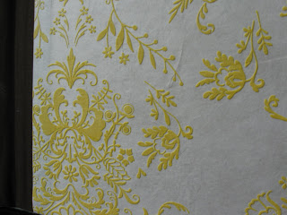
This is a close up of the front cover. As you can see I used a french roast brown to go on the binding to go along with the bright yellow and white paper used for the actual cover. The cover is actually used with a lightweight book cover that was on sale for 50% off at Paper Source. It has a papyrus feel to the white parts of the cover, but the yellow parts are slightly raised off the main sheet. The texture is almost a "rubbery" feel? Well thats what I feel, but just wonderful stuff, and I still have some left which is fantastic since it is such neat paper.


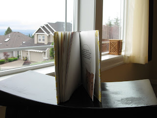
This is a side view of my book. A total of 30 pages; some are double sided making it really 38 pages.


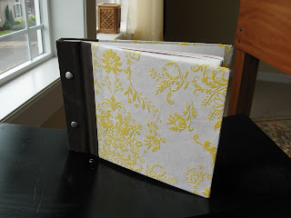
And the final veiw of the book. I loved how it turned out, and except for a few bumbles such as glue, and "exposed" book binding, the book has turned out very well. Only one other person created the whole book binding like mine and so I was proud that I spent a little more time to create something different (although some of those other books were fantastic I must admit, there were some that I just wanted to have a copy of just because they were so neat like the straw one, or the barn one)